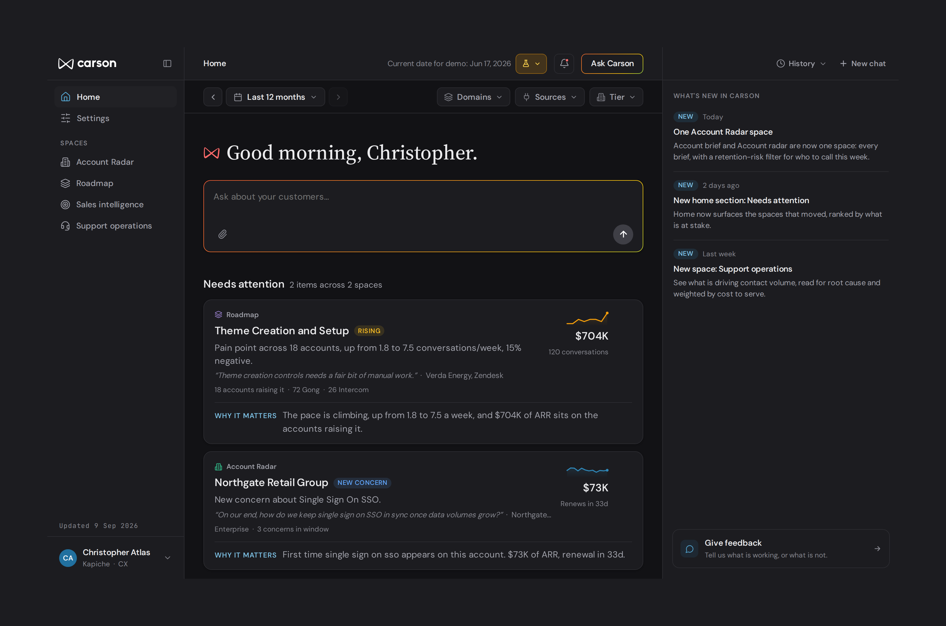
Carson home screen: what needs attention, ranked by what is at stake
Kapiche · Product interface

Carson: analytics for people who aren’t analysts

I designed a self-serve analytics tool where the interface does the analyst’s job for non-technical people, explaining why each number matters and ranking by what’s at stake. It was about to enter a customer pilot when I left.
Before · --green-600
Sentiment is trending positive
#059669 · 3.7:1
Fails AA as text
After · --green-600
Sentiment is trending positive
#047857 · 5.5:1
Passes AA
Before · --amber-600
Two renewal calls missed
#D97706 · 3.1:1
Fails AA as text
After · --amber-600
Two renewal calls missed
#B45309 · 5.0:1
Passes AA
Kapiche · Design system

Cambium to Carson: evolving a design system across nine years and three sources of truth

I built and maintained Kapiche’s design system for nine years, then fixed the drift between Figma, Claude Design and the repo while extending it into Carson.

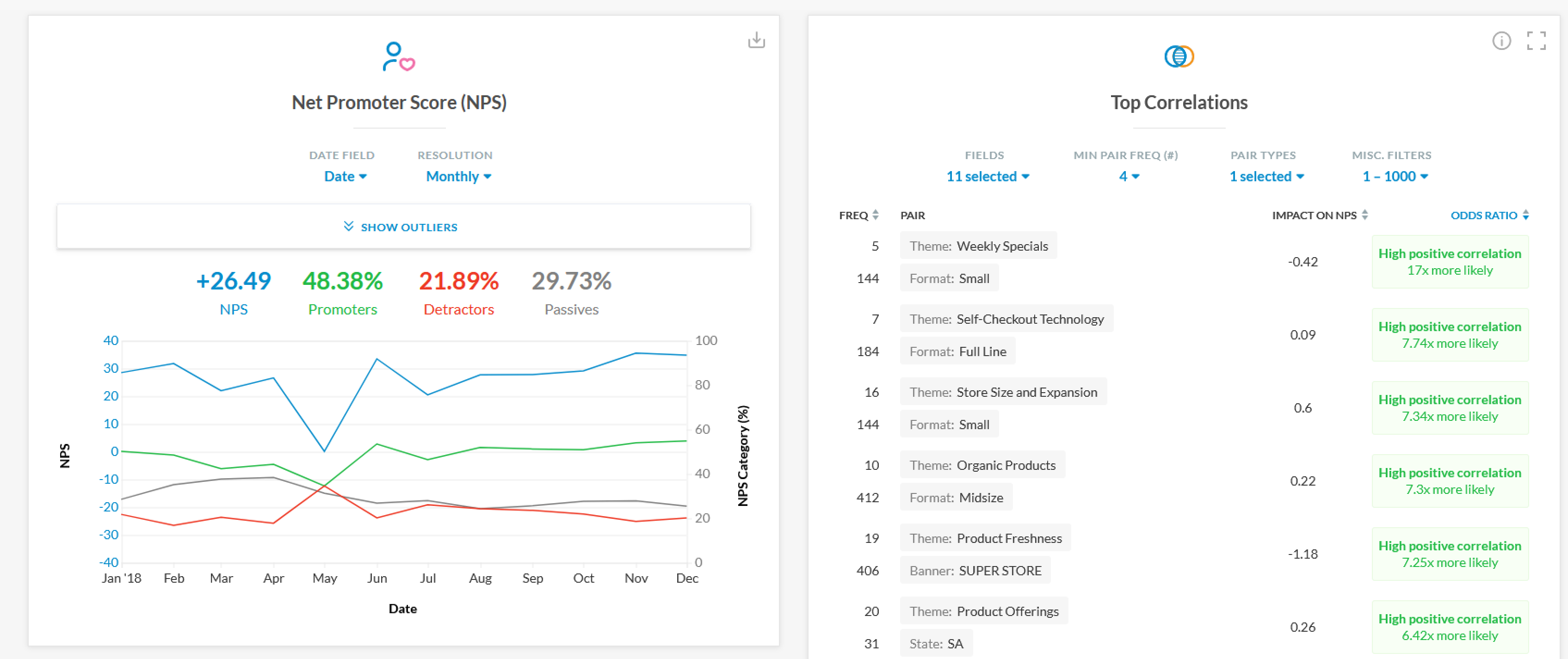
The original Kapiche dashboards: NPS and top correlations widgets, each with its own configuration controls
Kapiche · Data visualisation

Kapiche dashboards: from charts to headlines

I designed Kapiche’s dashboards and kept refining them from customer feedback, including a date picker that cut the most common request reaching customer success, raised by 70% of accounts, to a few specialised cases. Then I designed a home screen concept built around headlines instead of charts.

“I also want to say how much I am enjoying the collaboration and partnership throughout this process. The effort your team is putting into creating a seamless experience for our team, while also providing such valuable coaching insights and data, is greatly appreciated.”
Alpha testing customer, on working with the team